Manav, Banu
Loading...

Profile URL
Name Variants
Manav, B.
Banu, Manav
Banu Manav
MANAV, Banu
MANAV, BANU
Manav, Banu
M.,Banu
BANU MANAV
B. Manav
Manav B.
M., Banu
Manav,B.
Banu MANAV
Manav,Banu
Manav, BANU
Baybars Hawks, Banu
manav, banu
Banu, Manav
Banu Manav
MANAV, Banu
MANAV, BANU
Manav, Banu
M.,Banu
BANU MANAV
B. Manav
Manav B.
M., Banu
Manav,B.
Banu MANAV
Manav,Banu
Manav, BANU
Baybars Hawks, Banu
manav, banu
Job Title
Prof. Dr.
Email Address
Main Affiliation
Interior Architecture and Environmental Design
Status
Current Staff
Website
ORCID ID
Scopus Author ID
Turkish CoHE Profile ID
Google Scholar ID
WoS Researcher ID
Sustainable Development Goals
11
SUSTAINABLE CITIES AND COMMUNITIES

0
Research Products
17
PARTNERSHIPS FOR THE GOALS

1
Research Products
14
LIFE BELOW WATER

0
Research Products
8
DECENT WORK AND ECONOMIC GROWTH

0
Research Products
15
LIFE ON LAND

0
Research Products
1
NO POVERTY

0
Research Products
7
AFFORDABLE AND CLEAN ENERGY

1
Research Products
6
CLEAN WATER AND SANITATION

0
Research Products
12
RESPONSIBLE CONSUMPTION AND PRODUCTION

0
Research Products
16
PEACE, JUSTICE AND STRONG INSTITUTIONS

6
Research Products
9
INDUSTRY, INNOVATION AND INFRASTRUCTURE

0
Research Products
3
GOOD HEALTH AND WELL-BEING

0
Research Products
2
ZERO HUNGER

0
Research Products
4
QUALITY EDUCATION

0
Research Products
10
REDUCED INEQUALITIES

0
Research Products
13
CLIMATE ACTION

0
Research Products
5
GENDER EQUALITY

2
Research Products
Documents
20
Citations
495
h-index
9
Documents
0
Citations
0
Scholarly Output
33
Articles
16
Views / Downloads
490/2920
Supervised MSc Theses
8
Supervised PhD Theses
0
WoS Citation Count
152
Scopus Citation Count
207
WoS h-index
5
Scopus h-index
7
Patents
0
Projects
0
WoS Citations per Publication
4.61
Scopus Citations per Publication
6.27
Open Access Source
20
Supervised Theses
8
| Journal | Count |
|---|---|
| Physical Review Research | 2 |
| Color Research & Application | 1 |
| Creative Industries Journal | 1 |
| Frontiers in Psychology | 1 |
| Frontiers of Architectural Research | 1 |
Current Page: 1 / 3
Scopus Quartile Distribution
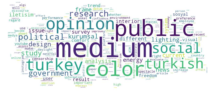
Competency Cloud
33 results
Scholarly Output Search Results
Now showing 1 - 10 of 33
Article Citation - WoS: 13Citation - Scopus: 15Preference for Accent and Background Colors in Interior Architecture in Terms of Similarity/Contrast of Natural Color System Attributes(WILEY, 2021) Juan, Serra; Gouaich, Yacine; Manav, Banu; Serra, JuanColor combination criteria are said to entail an affective response in interior design. We investigated the color combination criteria that orient the preference of current observers, after Le Corbusier's 1931 Salubra keyboards. We explored the similarity/contrast in Natural Color System (NCS) hue, blackness, and chromaticness in 312 combinations with four colors, two backgrounds and two accent colors, coming from 43 individual colors, on the walls of a simulated interior of a bedroom from the Swiss Pavilion (Le Corbusier, 1930-1931). Participants were 644 students of architecture and interior design in Western Europe and Near East, who evaluated with a Likert scale their preference for virtual images via an online survey. Results indicate that the most preferred color combinations are those with hues closer in the color wheel, being the similarity between hues in the backgrounds more important than in the accent colors, and with NCS B30G to G as the most preferred hues. Observers preferred color compositions with blackness under 10% and similar blackness between the two background colors, together with a certain blackness contrast between these background colors and the two color accents. Similarly, observers liked color compositions with low chromaticness and low chromaticness difference among the four colors of the composition.Article Citation - Scopus: 3Will peace flourish in the end? The history of suffering: Terrorism in Turkey(2013) Baybars Hawks, BanuFor the past 30 years, the PKK has launched a campaign of terror in Turkey. Despite the rise and fall of attacks throughout the years, the PKK's terrorist activities have never completely ended. Through the recent initiative of the Turkish government, negotiations focusing on pacification have been launched with the leader of the PKK, Abdullah Öcalan, who is still in prison on Imrali Island. We have yet to see the outcome of this process. Terrorism is not simply about killing people; it is about destroying the population's sense of well-being and trust in the government. In addition to the casualties and physical pain caused directly by an attack, the normal reaction to an unfamiliar and life-threatening event - fear, stress, worry, grief and confusion -also inflict suffering and social pain. In a world where information and communication play a key part, terrorists try to achieve the maximum possible media impact by the violent acts they commit. So when we define terrorism, we have to keep in mind that a three-way relationship exists between the main protagonists: terrorists want something from the government and work to achieve it through the agency of public opinion by seeking to terrorize the public at large in the most spectacular way possible. Public opinion in turn is influenced by the media which sometimes produces exaggerated accounts of terrorist events. This paper will seek to examine how this three way relationship has developed during the negotiation process with the PKK in Turkey. It will investigate how the ruling government (AKP) initiated the process, how public opinion has been formed in such an environment and whether it has influenced the government's policies and decisions in regard to this issue. It will also explore how the media has reacted during this process. It is the author's hope that the findings will be useful for policy-makers, media scholars, and academicians, as well as lay readers interested in the topic.Conference Object A Country Under Siege: Reflection of Identity Crisis on the Formation of Public Opinion in Turkey(Int Business Information Management Assoc-IBIMA, 2016) Baybars Hawks, BanuTo date academic attention in social sciences remains inadequate with regard to research and analysis of public opinion in Turkey. Most of the existing research has assessed the public opinion during political election periods. Therefore it is of great interest to find out what the public thinks about current issues in the country and how to interpret the results to be able to reveal whether they may have any reflections on social political and cultural structure of the country. The current study aims to fill this gap. The research on political and social trends in Turkish public opinion has been conducted since 2010 by Kadir Has University Turkey Research Center. The survey's objective is to reveal public opinion on the most important current issues in the country the economy terror the Kurdish Issue domestic and foreign policies the judicial system democracy and the media and social relations/life in Turkey. The data was collected via face to face interviews. The sample included 1000 respondents representative of the country's population aged 18 and above residing in the city centers of 26 cities in Turkey.Article Framing the Russian aircraft crisis: News discourse in Turkey’s polarized media environment(Forsnet, 2018) Özçetin, Burak; Baybars Hawks, Banu; Hawks, Banu BaybarsThis article analyzes the way in which the downing of a Russian aircraft by a Turkish F-16 jet on 24 November 2015 was framed by pro-government (Türkiye, Yeni Akit, Yeni Şafak) and anti-government (Cumhuriyet) newspapers. Framing means selecting some aspects of a perceived reality and making them more salient in a communicating text. News frames give us definitions and identify those responsible for an event; make moral judgements; and propose solutions to problems. The analysis of the news frames utilized by four newspapers underlines the fact that in a polarized media environment news frames are highly politicized and the distinction between news frames and official discourse is frequently blurred.Article A Design Education and Application Center To Support Creative Industries(Taylor & Francis Ltd, 2024) Manav, BanuAs the importance of creative industries has become widespread, creative-cultural economy policies have become a priority area worldwide. In this context, this report describes a project planned and built to develop a model for platforms that would bring together public, private, and academic institutions. It describes how this model, designed to support research and design-based work in the field of interior design, was developed. The main motivation in this project is to become an important meeting point to feed creative industries' ecosystem in Istanbul with the education-workshop-incubation model. It also aims to supply an environment of interaction for academics, design centers, entrepreneurs, and students. After one and a half years, it has become a digital and physical meeting point for university-sector representatives. An effective knowledge and technology transfer network has been set up. A scientific research project has been written and approved. In this way, the center will start to become a place for interdisciplinary design research. Scientific publications were prepared, presented at congresses, national and international panels, trainings were given, scientific publications were prepared and published, and efforts were made to increase the impact of the center on the importance of design research culture and high value-added design.Master Thesis Tüketici Algısında Kurumsal İtibar ile Marka Değeri Arasındaki İlişki(Kadir Has Üniversitesi, 2015) Tekay, Umut Can; Baybars Hawks, BanuÇalışmamın amacı kurumsal itibar ve marka değeri arasındaki ilişkinin tespit edilmesidir. Araştırmamda uygulama örneği olarak TNT International Express Taşımacılık Tic. Ltd. Şti. seçilmiş ve veri toplama aracı olarak anket uygulanmıştır. Kullanılan anket fonnu üç bölümden oluşmaktadır. Birinci bölümde demografik bilgilere ilişkin sorular, ikinci bölümde kurumsal itibara yönelik sorular ve son bölümde marka değerine yönelik sorular yer almaktadır. Araştırmanın evrenini TNT firması müşterileri oluşturmaktadır. Araştırmada basit tesadüfi örneklem yöntemiyle ulaşılan 366 kişiye anket uygulanmıştır. Araştırmada veri analizi SPSS 16 paket programında yapılmıştır. Araştırma sonucunda kurumsal itibar ve marka değeri algısı arasında anlamlı ve pozitif yönde bir ilişkiye rastlanmıştır.Book Part Illusion or Reality? the Balance Between Security and Freedom of Expression in the United States and Turkey(International Institute of Informatics and Systemics, IIIS, 2016) Baybars Hawks, BanuCensorship is no longer limited to traditional media such as print media and TV. With the invention of Internet, the impact of censorship is felt much more strongly with regard to new media related resources of information and communication. With the escalation of terrorism in the 21stcentury, the governments all around the world have begun to use terrorist incidents as the main justification in their efforts to curb freedoms. Within this context, the primary argument of the governments in regulating the media is to prevent negative effect of certain speech or expression, including the ones threatening national security. On the other hand, the counter arguments states that freedom of speech and expressions are the fundamental rights of all citizens, and therefore, people have the right to be free from governmental control that inhibits thoughts, ideas, and free expression. This paper argues that the media freedom to report on news without restriction or censorship is one of the defining qualities of a liberal democratic system and proposes to examine the restrictions on media as a form of censorship; this hence is the violation of media freedom.Master Thesis Kurumsal İletişimde Yeni Bir Platform Olarak Sosyal Medya Kullanımı : Üniversitelere Yönelik Bir Kurumsal İletişim Uygulaması(Kadir Has Üniversitesi, 2015) Silen, Duygu; Baybars Hawks, BanuSosyal medyanin son on yillik surecte gunluk hayatta en cok tercih edilen iletisim araclarindan birisi haline gelmesiyle birlikte onemi her gecen gun artmaktadir. Her ne kadar ag tabanli iletisim sistemleri iletisim teknolojilerindeki gelismenin bir yansimasi olarak kurumsal iletisim alaninda uzun yillardir kullanilmaya devam ediliyor olsa da sosyal aglar bazi ozellikleri ile cevrimici sitelerden farkliliklar barindirmaktadir. Bu calismada universitelerin kurumsal iletisim faaliyetlerinde sosyal medya kullaniminin rolu kullanicilarin algi ve davranislarinin sosyal medya kurumsal iletisiminin verimliligi uzerindeki etkisini performans beklentisi caba beklentisi sosyal etki ve hizlandirici kosullar olmak uzere dort faktor uzerinden degerlendirmekte kullanilan BTKK (UTAUT) modeli uygulanarak analiz edilmektedir. universite ogrencilerinin sosyal medya tabanli kurumsal iletisim davranis ve algilarini degerlendirmek uzere Kadir Has universitesi'nde egitim gormekte olan 188 ogrencinin katilimiyla bir anket calismasi gerceklestirilmistir. Bu calisma ayni zamanda universite tercihi doneminde universiteler tarafindan gerceklestirilen sosyal medya iletisiminin ogrenciler uzerindeki etkisini de arastirmaktadir. Arastirma sonucu gostermistir ki sosyal medya ogrencilerin universiteleri tarafindan yapilan kurumsal iletisim faaliyetlerini takip etmeleri ve bu aktivitelere katilimlarini saglama noktasinda olumlu sonuclar dogurmaktayken ote yandan universite oncesi donemde ogrencilerin okul secimi ile ilgili kararlari uzerinde pek etkili olmamaktadir.Conference Object Public Opinion in Turkey: Social and Political Implications of Recent Trends(Int Business Information Management Assoc-Ibima, 2018) Baybars Hawks, BanuThis study reveals what the public thinks about current issues in Turkey, and whether the recent trends have any reflections on social, political, and cultural structure of the country. The data collected with this research provide important insights into public's opinion regarding current and potential issues in Turkey, and also guide policymakers in shaping the public policies. The outputs of this study may also encourage scholars and researchers from different fields and backgrounds to study and discuss public opinion with its complex dynamics and milieu of dimensions. This research delivers some of the most evocative and current issues in Turkey; the most important current problems, the economy, terror, the Kurdish issue, government and opposition parties' evaluations, political vacuum, institutional evaluations, political polarization/judicial system, democracy and social relations/change in Turkey. According to the survey, the Turkish public views "terrorism" as the most important problem facing the country. The most critical economic issues are determined as unemployment, depreciation of the Turkish lira. In addition to these, foreign policy approval rate and support for EU membership increased. While the media was again the least trusted institution, trust in institutions generally increased.Article Citation - WoS: 4Framing the Russian Aircraft Crisis: News Discourse in Turkey's Polarized Media Environment(Uluslararası İlişkiler Konseyi Derneği, 2018) Özçetin, Burak; Baybars Hawks, BanuThis article analyzes the way in which the downing of a Russian aircraft by a Turkish F-16 jet on 24 November 2015 was framed by pro-government (Turkiye Yeni Akit Yeni Safak) and anti-government (Cumhuriyet) newspapers. Framing means selecting some aspects of a perceived reality and making them more salient in a communicating text. News frames give us definitions and identify those responsible for an event make moral judgements, and propose solutions to problems. The analysis of the news frames utilized by four newspapers underlines the fact that in a polarized media environment news frames are highly politicized and the distinction between news frames and official discourse is frequently blurred.
